Flutter Theme Guide: Light Mode, Dark Mode, System Theme and Custom Brand Colors
A Quick Story to Set the Scene
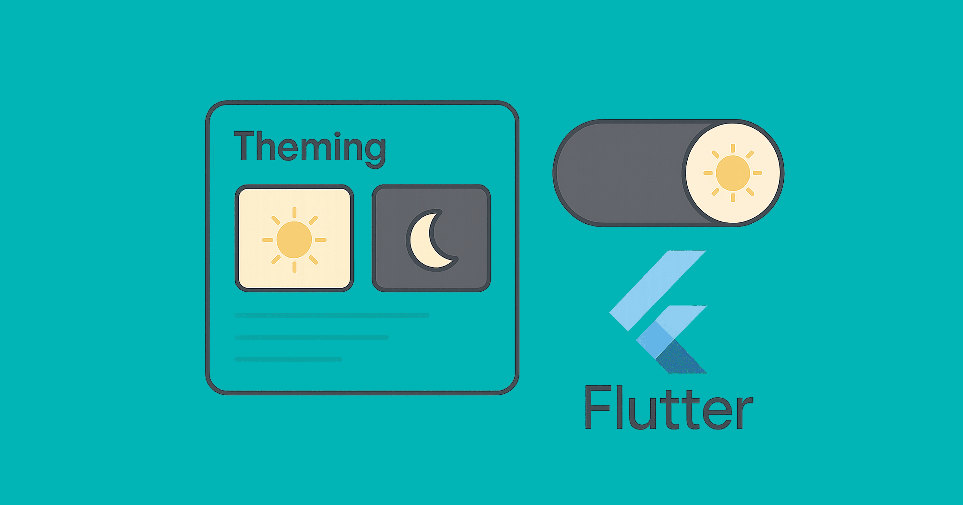
Meet Lumi and Nyx. They share one Flutter app. Lumi prefers light mode — bright cards, cheerful blues, a UI that feels open. Nyx wants the opposite — calm grays, a dark background, something easier on the eyes at night.
Your job as the developer? One app, two moods, zero duplication.
That's what theming is for. In this article, we'll build a clean, production-ready theme system that:
- switches between light, dark, and system modes,
- centralizes colors, typography, shapes, and spacing,
- supports quick toggles and persistence, and
- scales with Theme Extensions for custom brand tokens.
Theme 101: What Actually Is a Theme?
Before writing any code, it's worth getting the terminology straight:
ThemeData— the master container for all visual settings: colors, typography, shapes, component styles.ColorScheme— the Material 3 color palette. Always prefer this over manual color assignments.ThemeMode— tells Flutter which theme to use:light,dark, orsystem.Theme.of(context)— how you read the active theme from inside any widget.AnimatedTheme— wraps widgets and animates smoothly when the theme changes.ThemeExtension— lets you attach custom design tokens (like spacing or border radii) directly to the theme.
Project Skeleton
We'll start with Material 3, wire up a ColorScheme, add a quick toggle, and persist the user's choice.
import 'package:flutter/material.dart';
import 'package:shared_preferences/shared_preferences.dart';

void main() async {
  WidgetsFlutterBinding.ensureInitialized();
  final prefs = await SharedPreferences.getInstance();
  final saved = prefs.getString('themeMode') ?? 'system';
  final initialMode = _parseThemeMode(saved);

  runApp(AppRoot(initialMode: initialMode, prefs: prefs));
}

ThemeMode _parseThemeMode(String s) => switch (s) {
  'light' => ThemeMode.light,
  'dark' => ThemeMode.dark,
  _ => ThemeMode.system,
};

class AppRoot extends StatefulWidget {
  const AppRoot({super.key, required this.initialMode, required this.prefs});
  final ThemeMode initialMode;
  final SharedPreferences prefs;

  @override
  State<AppRoot> createState() => _AppRootState();
}

class _AppRootState extends State<AppRoot> {
  late ThemeMode _mode = widget.initialMode;

  Future<void> _setMode(ThemeMode m) async {
    setState(() => _mode = m);
    await widget.prefs.setString('themeMode', switch (m) {
      ThemeMode.light => 'light',
      ThemeMode.dark => 'dark',
      ThemeMode.system => 'system',
    });
  }

  @override
  Widget build(BuildContext context) {
    return MaterialApp(
      title: 'Lumi & Nyx',
      debugShowCheckedModeBanner: false,
      themeMode: _mode,
      theme: AppTheme.light,
      darkTheme: AppTheme.dark,
      home: HomeScreen(
        mode: _mode,
        onChangeMode: _setMode,
      ),
    );
  }
}
A few things worth noting here:
- We read
SharedPreferenceson startup to restore the user's last chosen mode. MaterialApptakes three separate knobs:theme,darkTheme, andthemeMode.- Calling
_setModetriggers a rebuild and also writes the choice to disk.
Your Design Tokens: ColorScheme-First (Material 3)
class AppTheme {
  static const _seed = Color(0xFF4F46E5);
  static const _error = Color(0xFFB00020);

  static final ColorScheme _lightScheme = ColorScheme.fromSeed(
    seedColor: _seed,
    brightness: Brightness.light,
    error: _error,
  );

  static final ColorScheme _darkScheme = ColorScheme.fromSeed(
    seedColor: _seed,
    brightness: Brightness.dark,
    error: _error,
  );

  static ThemeData get light => ThemeData(
        useMaterial3: true,
        colorScheme: _lightScheme,
        scaffoldBackgroundColor: _lightScheme.background,
        appBarTheme: AppBarTheme(
          backgroundColor: _lightScheme.surface,
          foregroundColor: _lightScheme.onSurface,
          elevation: 0,
          centerTitle: false,
        ),
        textTheme: _textTheme(_lightScheme),
        cardTheme: CardTheme(
          elevation: 0,
          margin: const EdgeInsets.all(12),
          shape: RoundedRectangleBorder(
            borderRadius: BorderRadius.circular(16),
          ),
        ),
        extensions: const <ThemeExtension<dynamic>>[
          AppSpacing.compact,
        ],
      );

  static ThemeData get dark => ThemeData(
        useMaterial3: true,
        colorScheme: _darkScheme,
        scaffoldBackgroundColor: _darkScheme.background,
        appBarTheme: AppBarTheme(
          backgroundColor: _darkScheme.surface,
          foregroundColor: _darkScheme.onSurface,
          elevation: 0,
          centerTitle: false,
        ),
        textTheme: _textTheme(_darkScheme),
        cardTheme: CardTheme(
          elevation: 0,
          margin: const EdgeInsets.all(12),
          shape: RoundedRectangleBorder(
            borderRadius: BorderRadius.circular(16),
          ),
        ),
        extensions: const <ThemeExtension<dynamic>>[
          AppSpacing.compact,
        ],
      );

  static TextTheme _textTheme(ColorScheme scheme) {
    return Typography.material2021().black.apply(
      bodyColor: scheme.onBackground,
      displayColor: scheme.onBackground,
    );
  }
}
ColorScheme.fromSeed does a lot of heavy lifting — it derives a full, harmonious palette (primary, secondary, surface, background, and their "on" counterparts) from a single brand color, for both light and dark. You wire it in once and everything else just works.
Pro Move: ThemeExtension for Brand Tokens
The built-in ThemeData covers most cases, but real apps often need things like consistent spacing values, custom border radii, or brand-specific shadow levels. ThemeExtension is the right way to handle this — it keeps your tokens in the theme tree, not scattered as constants across the codebase.
@immutable
class AppSpacing extends ThemeExtension<AppSpacing> {
  final double xs, sm, md, lg, xl;
  const AppSpacing({
    required this.xs,
    required this.sm,
    required this.md,
    required this.lg,
    required this.xl,
  });

  static const compact = AppSpacing(xs: 4, sm: 8, md: 12, lg: 16, xl: 24);

  @override
  AppSpacing copyWith({double? xs, double? sm, double? md, double? lg, double? xl}) {
    return AppSpacing(
      xs: xs ?? this.xs,
      sm: sm ?? this.sm,
      md: md ?? this.md,
      lg: lg ?? this.lg,
      xl: xl ?? this.xl,
    );
  }

  @override
  AppSpacing lerp(ThemeExtension<AppSpacing>? other, double t) {
    if (other is! AppSpacing) return this;
    double lerpDouble(double a, double b) => a + (b - a) * t;
    return AppSpacing(
      xs: lerpDouble(xs, other.xs),
      sm: lerpDouble(sm, other.sm),
      md: lerpDouble(md, other.md),
      lg: lerpDouble(lg, other.lg),
      xl: lerpDouble(xl, other.xl),
    );
  }
}

extension SpacingX on BuildContext {
  AppSpacing get space => Theme.of(this).extension<AppSpacing>()!;
}
Using it in widgets is clean and readable:
Padding(
  padding: EdgeInsets.all(context.space.lg),
  child: const Text('Consistent spacing everywhere.'),
)
Quick Theme Switching UI (With Animation)
class HomeScreen extends StatelessWidget {
  const HomeScreen({super.key, required this.mode, required this.onChangeMode});
  final ThemeMode mode;
  final ValueChanged<ThemeMode> onChangeMode;

  @override
  Widget build(BuildContext context) {
    final scheme = Theme.of(context).colorScheme;

    return Scaffold(
      appBar: AppBar(
        title: const Text('Lumi & Nyx'),
        actions: [
          PopupMenuButton<ThemeMode>(
            icon: const Icon(Icons.light_mode),
            initialValue: mode,
            onSelected: onChangeMode,
            itemBuilder: (context) => const [
              PopupMenuItem(value: ThemeMode.system, child: Text('System')),
              PopupMenuItem(value: ThemeMode.light, child: Text('Light')),
              PopupMenuItem(value: ThemeMode.dark, child: Text('Dark')),
            ],
          ),
        ],
      ),
      body: AnimatedTheme(
        duration: const Duration(milliseconds: 250),
        data: Theme.of(context),
        child: Center(
          child: Card(
            color: scheme.surface,
            child: Padding(
              padding: EdgeInsets.all(context.space.xl),
              child: Text(
                'This card adapts to the active theme.',
                style: Theme.of(context).textTheme.titleLarge,
              ),
            ),
          ),
        ),
      ),
      floatingActionButton: FloatingActionButton.extended(
        onPressed: () {
          final next = switch (mode) {
            ThemeMode.system => ThemeMode.light,
            ThemeMode.light => ThemeMode.dark,
            ThemeMode.dark => ThemeMode.system,
          };
          onChangeMode(next);
        },
        label: Text('Mode: ${mode.name}'),
        icon: const Icon(Icons.auto_mode),
      ),
    );
  }
}
The FAB cycles through modes quickly; the menu gives the user explicit control. AnimatedTheme handles the transition so the switch doesn't feel abrupt.
Custom Fonts and Typography
Add your font to pubspec.yaml:
flutter:
  uses-material-design: true
  fonts:
    - family: Inter
      fonts:
        - asset: assets/fonts/Inter-Regular.ttf
        - asset: assets/fonts/Inter-Medium.ttf
          weight: 500
        - asset: assets/fonts/Inter-SemiBold.ttf
          weight: 600
Then apply it in your AppTheme:
static TextTheme _textTheme(ColorScheme scheme) {
  final base = Typography.material2021().black;
  return base.apply(
    fontFamily: 'Inter',
    bodyColor: scheme.onBackground,
    displayColor: scheme.onBackground,
  );
}
If you want a different type scale in dark mode, you can create a separate builder for it.
Respecting the System Theme
Using ThemeMode.system is the right default — it automatically follows the OS-level setting on Android, iOS, macOS, and Windows. If you ever need to query it manually:
final isDark = MediaQuery.of(context).platformBrightness == Brightness.dark;
One practical note: if you're offering a manual override toggle, make sure you're also persisting the choice. Otherwise users will find their preference reset every time they launch the app.
Reading Theme Correctly Inside Widgets
The single most common theming mistake in Flutter codebases is hardcoding colors. It breaks dark mode and makes brand updates painful.
Do this:
final cs = Theme.of(context).colorScheme;

Container(
  decoration: BoxDecoration(
    color: cs.surface,
    borderRadius: BorderRadius.circular(16),
  ),
  child: Text('Hello', style: Theme.of(context).textTheme.bodyLarge),
);
Avoid this:
Container(color: Colors.white);
Text('Hello', style: TextStyle(color: Colors.black));
Hardcoded colors are invisible to the theme system. They'll look wrong in dark mode and require manual updates whenever your brand changes.
Status Bar and System Overlays
This detail is easy to overlook but visible to every user. Make sure your status bar icons stay readable against both themes:
AppBar(
  systemOverlayStyle: Theme.of(context).brightness == Brightness.dark
      ? SystemUiOverlayStyle.light
      : SystemUiOverlayStyle.dark,
);
For custom areas without an AppBar, wrap with AnnotatedRegion<SystemUiOverlayStyle>.
Theming Cupertino Widgets
If your app uses Cupertino-style components alongside Material ones, pass the current theme through:
CupertinoTheme(
  data: CupertinoThemeData(
    brightness: Theme.of(context).brightness,
    primaryColor: Theme.of(context).colorScheme.primary,
  ),
  child: const CupertinoButton(child: Text('iOS style'), onPressed: null),
);
Multiple Brand Themes
Some apps need more than light and dark — think "Blue plan" vs "Green plan", or white-labeled variants. You can handle this with the same approach:
enum Brand { indigo, green }

final brandThemes = <Brand, ThemeData>{
  Brand.indigo: AppTheme.light,
  Brand.green: AppTheme.light.copyWith(
    colorScheme: ColorScheme.fromSeed(seedColor: const Color(0xFF0EA5A5)),
  ),
};
Swap brandThemes[currentBrand]! the same way you'd swap ThemeMode, and persist the choice.
Common Pitfalls
A few things that come up repeatedly in code reviews:
- Hardcoded colors — the most frequent issue. Always pull from
Theme.of(context).colorScheme. - Missing
darkTheme— if you only settheme, your app will show the light theme on dark-mode devices. - No persistence — users expect their theme preference to survive an app restart.
- Text contrast issues — use
onSurface,onBackground, and similar "on" colors fromColorSchemeinstead of guessing. - No animation —
AnimatedThemeis a small addition that makes theme switches feel intentional rather than jarring. - Scattered global tokens — if you're defining spacing or border radii as constants spread across files, move them into a
ThemeExtension.
A Quick Checklist Before Shipping
- Material 3 enabled with
useMaterial3: true - Both
themeanddarkThemeprovided themeModepersisted across sessions- Quick toggle available, with system mode as an option
- Custom fonts applied via
TextTheme - Brand-specific tokens in a
ThemeExtension - Animated transitions on theme change
- Status bar icon colors correct per theme
- No hardcoded colors anywhere in widgets
Key Takeaways
ThemeMode controls which theme is active. ColorScheme is your source of truth for colors — build it from a seed and let Flutter derive the rest. ThemeExtension is the right place for custom design tokens like spacing and radii. Persist the user's preference and animate transitions. And keep hardcoded colors out of your widgets entirely — your future self will thank you.