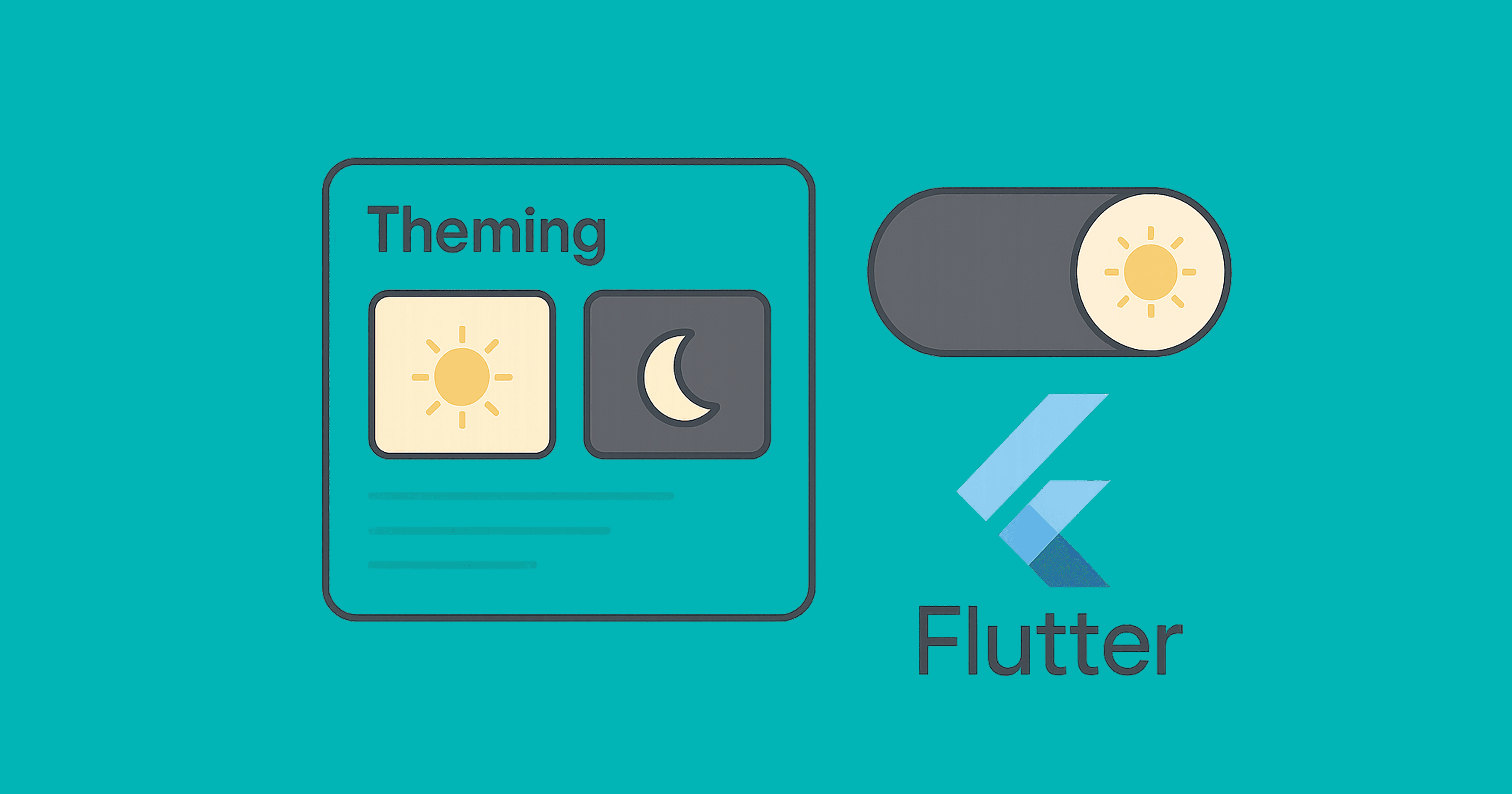
🎨 Flutter Theme Magic: Light, Dark, System — and Your Own Beautiful Brand
🌟 A tiny story to start
Meet Lumi (loves light mode) and Nyx (prefers dark). They share one Flutter app.
Lumi wants bright cards and cheerful blues; Nyx wants calm grays and a cozy dark background.
Your job as the developer? One app, two moods, zero duplication.
That’s what theming is for.
We’ll build a clean, modern theme system that:
switches between light / dark / system modes,
centralizes colors, typography, shapes, paddings,
supports quick toggles and persistence, and
scales with Theme Extensions for pro-level customization.
🧠 Theme 101: What actually is a Theme?
ThemeData: the big bag of app visuals (colors, typography, shapes, etc.).ColorScheme: the modern, Material 3–style color palette. Prefer this!ThemeMode: chooses light, dark, or system.Theme.of(context): read current theme.AnimatedTheme: smoothly animate theme changes.ThemeExtension: add your own themeable tokens (e.g., brand spacing).
🏗️ Project skeleton
We’ll use Material 3 with a ColorScheme, add a quick toggle, and persist the choice.
import 'package:flutter/material.dart';
import 'package:shared_preferences/shared_preferences.dart';

void main() async {
  WidgetsFlutterBinding.ensureInitialized();
  final prefs = await SharedPreferences.getInstance();
  final saved = prefs.getString('themeMode') ?? 'system';
  final initialMode = _parseThemeMode(saved);

  runApp(AppRoot(initialMode: initialMode, prefs: prefs));
}

ThemeMode _parseThemeMode(String s) => switch (s) {
  'light' => ThemeMode.light,
  'dark' => ThemeMode.dark,
  _ => ThemeMode.system,
};

class AppRoot extends StatefulWidget {
  const AppRoot({super.key, required this.initialMode, required this.prefs});
  final ThemeMode initialMode;
  final SharedPreferences prefs;

  @override
  State<AppRoot> createState() => _AppRootState();
}

class _AppRootState extends State<AppRoot> {
  late ThemeMode _mode = widget.initialMode;

  Future<void> _setMode(ThemeMode m) async {
    setState(() => _mode = m);
    await widget.prefs.setString('themeMode', switch (m) {
      ThemeMode.light => 'light',
      ThemeMode.dark => 'dark',
      ThemeMode.system => 'system',
    });
  }

  @override
  Widget build(BuildContext context) {
    return MaterialApp(
      title: 'Lumi & Nyx',
      debugShowCheckedModeBanner: false,
      themeMode: _mode,
      theme: AppTheme.light,
      darkTheme: AppTheme.dark,
      home: HomeScreen(
        mode: _mode,
        onChangeMode: _setMode,
      ),
    );
  }
}
What’s happening here
We load
SharedPreferencesto restore the last chosenThemeMode.MaterialAppreceives three knobs:theme,darkTheme, andthemeMode.Calling
_setModeupdates UI and persists the choice.
🎯 Your design tokens: ColorScheme-first (Material 3)
class AppTheme {
  // Brand seeds
  static const _seed = Color(0xFF4F46E5); // Indigo-ish
  static const _error = Color(0xFFB00020);

  static final ColorScheme _lightScheme = ColorScheme.fromSeed(
    seedColor: _seed,
    brightness: Brightness.light,
    error: _error,
  );

  static final ColorScheme _darkScheme = ColorScheme.fromSeed(
    seedColor: _seed,
    brightness: Brightness.dark,
    error: _error,
  );

  static ThemeData get light => ThemeData(
        useMaterial3: true,
        colorScheme: _lightScheme,
        scaffoldBackgroundColor: _lightScheme.background,
        appBarTheme: AppBarTheme(
          backgroundColor: _lightScheme.surface,
          foregroundColor: _lightScheme.onSurface,
          elevation: 0,
          centerTitle: false,
        ),
        textTheme: _textTheme(_lightScheme),
        cardTheme: CardTheme(
          elevation: 0,
          margin: const EdgeInsets.all(12),
          shape: RoundedRectangleBorder(
            borderRadius: BorderRadius.circular(16),
          ),
        ),
        extensions: const <ThemeExtension<dynamic>>[
          AppSpacing.compact,
        ],
      );

  static ThemeData get dark => ThemeData(
        useMaterial3: true,
        colorScheme: _darkScheme,
        scaffoldBackgroundColor: _darkScheme.background,
        appBarTheme: AppBarTheme(
          backgroundColor: _darkScheme.surface,
          foregroundColor: _darkScheme.onSurface,
          elevation: 0,
          centerTitle: false,
        ),
        textTheme: _textTheme(_darkScheme),
        cardTheme: CardTheme(
          elevation: 0,
          margin: const EdgeInsets.all(12),
          shape: RoundedRectangleBorder(
            borderRadius: BorderRadius.circular(16),
          ),
        ),
        extensions: const <ThemeExtension<dynamic>>[
          AppSpacing.compact,
        ],
      );

  static TextTheme _textTheme(ColorScheme scheme) {
    return Typography.material2021().black.apply(
      bodyColor: scheme.onBackground,
      displayColor: scheme.onBackground,
    );
  }
}
What’s happening
ColorScheme.fromSeedgives you a complete palette (primary, secondary, surface, background, etc.) for light and dark.We tune AppBar, Card, and Text with that scheme.
We already hint at ThemeExtension for spacing (next section).
➕ Pro move: ThemeExtension for your brand tokens
Add anything you want to theme (spacing, radii, shadows) — strongly typed.
@immutable
class AppSpacing extends ThemeExtension<AppSpacing> {
  final double xs, sm, md, lg, xl;
  const AppSpacing({
    required this.xs,
    required this.sm,
    required this.md,
    required this.lg,
    required this.xl,
  });

  static const compact = AppSpacing(xs: 4, sm: 8, md: 12, lg: 16, xl: 24);

  @override
  AppSpacing copyWith({double? xs, double? sm, double? md, double? lg, double? xl}) {
    return AppSpacing(
      xs: xs ?? this.xs,
      sm: sm ?? this.sm,
      md: md ?? this.md,
      lg: lg ?? this.lg,
      xl: xl ?? this.xl,
    );
  }

  @override
  AppSpacing lerp(ThemeExtension<AppSpacing>? other, double t) {
    if (other is! AppSpacing) return this;
    double lerpDouble(double a, double b) => a + (b - a) * t;
    return AppSpacing(
      xs: lerpDouble(xs, other.xs),
      sm: lerpDouble(sm, other.sm),
      md: lerpDouble(md, other.md),
      lg: lerpDouble(lg, other.lg),
      xl: lerpDouble(xl, other.xl),
    );
  }
}

extension SpacingX on BuildContext {
  AppSpacing get space => Theme.of(this).extension<AppSpacing>()!;
}
Usage in widgets
Padding(
  padding: EdgeInsets.all(context.space.lg),
  child: const Text('Hello, tokens 👋'),
)
⚡ Quick theme switching UI (with animation)
class HomeScreen extends StatelessWidget {
  const HomeScreen({super.key, required this.mode, required this.onChangeMode});
  final ThemeMode mode;
  final ValueChanged<ThemeMode> onChangeMode;

  @override
  Widget build(BuildContext context) {
    final scheme = Theme.of(context).colorScheme;

    return Scaffold(
      appBar: AppBar(
        title: const Text('Lumi & Nyx'),
        actions: [
          PopupMenuButton<ThemeMode>(
            icon: const Icon(Icons.light_mode),
            initialValue: mode,
            onSelected: onChangeMode,
            itemBuilder: (context) => const [
              PopupMenuItem(value: ThemeMode.system, child: Text('System')),
              PopupMenuItem(value: ThemeMode.light, child: Text('Light')),
              PopupMenuItem(value: ThemeMode.dark, child: Text('Dark')),
            ],
          ),
        ],
      ),
      body: AnimatedTheme(
        duration: const Duration(milliseconds: 250),
        data: Theme.of(context),
        child: Center(
          child: Card(
            color: scheme.surface,
            child: Padding(
              padding: EdgeInsets.all(context.space.xl),
              child: Text(
                'This card adapts to theme!',
                style: Theme.of(context).textTheme.titleLarge,
              ),
            ),
          ),
        ),
      ),
      floatingActionButton: FloatingActionButton.extended(
        onPressed: () {
          final next = switch (mode) {
            ThemeMode.system => ThemeMode.light,
            ThemeMode.light => ThemeMode.dark,
            ThemeMode.dark => ThemeMode.system,
          };
          onChangeMode(next);
        },
        label: Text('Mode: ${mode.name}'),
        icon: const Icon(Icons.auto_mode),
      ),
    );
  }
}
What’s happening
A menu for explicit selection and a FAB for quick cycling.
AnimatedThemegives a smooth fade between palettes.
🖍️ Custom fonts & typography (bonus polish)
- Add font to
pubspec.yaml(short form):
flutter:
  uses-material-design: true
  fonts:
    - family: Inter
      fonts:
        - asset: assets/fonts/Inter-Regular.ttf
        - asset: assets/fonts/Inter-Medium.ttf
          weight: 500
        - asset: assets/fonts/Inter-SemiBold.ttf
          weight: 600
- Apply to
ThemeData:
static TextTheme _textTheme(ColorScheme scheme) {
  final base = Typography.material2021().black;
  return base.apply(
    fontFamily: 'Inter',
    bodyColor: scheme.onBackground,
    displayColor: scheme.onBackground,
  );
}
Tip: If you need a different type scale in dark mode, make a second builder.
🖥️ Respect the system theme automatically
Using
ThemeMode.systemwill follow iOS/Android/Mac/Windows settings.You can also query current platform brightness:
final platformBrightness = MediaQuery.of(context).platformBrightness;
final isDark = platformBrightness == Brightness.dark;
Don’t mix manual toggles with this unless you persist the choice and clearly indicate what’s active.
🧪 Using theme correctly inside widgets
✅ Do
final cs = Theme.of(context).colorScheme;

Container(
  decoration: BoxDecoration(
    color: cs.surface,
    borderRadius: BorderRadius.circular(16),
    boxShadow: kElevationToShadow[1],
  ),
  child: Text('Hello', style: Theme.of(context).textTheme.bodyLarge),
);
❌ Avoid
// Hardcoding breaks dark mode and brand consistency:
Container(color: Colors.white);
Text('Hello', style: TextStyle(color: Colors.black));
🧯 Status bar & system overlays (important detail)
To guarantee readable status-bar icons per theme:
AppBar(
  systemOverlayStyle: Theme.of(context).brightness == Brightness.dark
      ? SystemUiOverlayStyle.light
      : SystemUiOverlayStyle.dark,
);
Or wrap a custom area with AnnotatedRegion<SystemUiOverlayStyle>.
🧩 Theming Cupertino widgets (when needed)
If you use Cupertino widgets, wrap them with CupertinoTheme or rely on MaterialApp bridging:
CupertinoTheme(
  data: CupertinoThemeData(
    brightness: Theme.of(context).brightness,
    primaryColor: Theme.of(context).colorScheme.primary,
  ),
  child: const CupertinoButton(child: Text('iOS vibe'), onPressed: null),
);
🗂️ Multiple brand themes (e.g., “Blue” vs “Green”)
Create multiple ColorSchemes and switch at runtime exactly like ThemeMode, or store them as theme presets:
enum Brand { indigo, green }

final brandThemes = <Brand, ThemeData>{
  Brand.indigo: AppTheme.light,
  Brand.green: AppTheme.light.copyWith(
    colorScheme: ColorScheme.fromSeed(seedColor: const Color(0xFF0EA5A5)),
  ),
};
Now you can toggle brandThemes[currentBrand]! with the same persistence approach.
🧱 Common pitfalls & fixes
Hardcoded colors → always pull from
Theme.of(context).colorScheme.Forgetting darkTheme → light theme bleeds into dark devices. Provide both.
Using
ThemeMode.darkwithout user control → frustrates users. Offer a toggle.Text contrast issues → rely on
onSurface,onBackground, etc., fromColorScheme.No animation → use
AnimatedThemefor smoothness (tiny but delightful).Global tokens scattered → centralize in
ThemeExtensions.
🧭 Checklist: “Done right” theming
Material 3 with
ColorScheme.Both
themeanddarkTheme.themeModepersisted (SharedPreferencesfine).Quick toggle + system option.
Fonts applied via
TextTheme.Brand tokens via
ThemeExtension.Animated transitions.
Correct status bar icon colors.
No hardcoded colors in widgets.
🧠 Key takeaways
ThemeMode controls which theme: light/dark/system.
ColorScheme is the modern source of truth — build from a seed.
ThemeExtension lets you add your own design tokens (spacing, radii, shadows…).
Persist user choice and animate changes for polish.
Always read colors/typography from Theme — not hardcoded values.